The Color Wheel Explained: Summary
Over the past few weeks we have covered a multitude of relationships in the color wheel in order to create color harmony. Here is a quick post that summarizes everything that we’ve learned about color relationships:
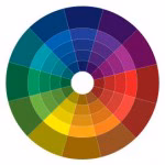
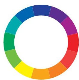
The color wheel is a tool that can be used to select coordinating color schemes. Most of us can identify the primary colors: Red, Yellow, and Blue. These three colors are the basis of everything. When you mix them two at a time you then get the secondary colors: Orange, Green, and Purple. The tertiary colors appear when you mix two secondary colors together and result in more complex appearances like red-orange and blue-green.
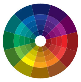
12 Step Color Wheel
Tertiary Colors
Secondary Colors
Primary Colors
What most of us look to create is color harmony. Harmony, by definition, is something that is pleasing and goes together. Color harmony would therefore describe an environment with pleasing colors that go together in a way that is exciting and elicits a pleasurable response. With colors that don’t reach this goal, our eyes are either bored or overwhelmed. To accomplish harmony, there are some easy associations that we can follow when choosing our colors that utilize the color wheel.
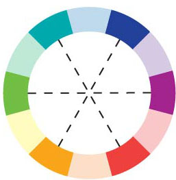
Complementary Colors: Those colors located opposite each other on a color wheel.

Analogous Colors: Those colors located close together on a color wheel.

Monochromatic Colors: these are shade or tint variations of the same hue. (ie. light pink, pink, dark pink)
Split-Complementary Relationship: Choose one color, find its opposite on the color wheel and then take the two colors directly next to it’s opposite.

Double-Complementary Relationship: Two complementary color sets; the distance between selected complementary pairs will effect the overall contrast of the final composition.

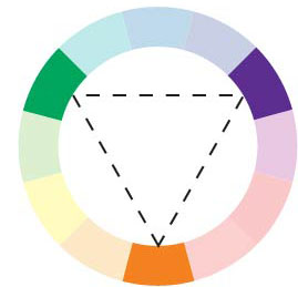
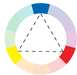
Triad Relationship: Three hues equally positioned on a color wheel.