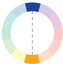
Complimentary Color Pairing
In this color-wheel installment we’ll cover complimentary colors. Last time we took a look at analogous, which are colors adjacent to each other on the color wheel. This time, the colors are directly opposite each other on the color wheel. Literally, take any color you choose on the wheel, and then draw a straight line to the other side: that color on the other side is the compliment of the color that you chose.
For now we’ll keep it simple by identifying only one complimentary pairing of colors, but there are more complex ways to use complimentary color in pairs, called double-complimentary (aka tetradic).
Last week we posted some famous art examples to illustrate analogous colors, and that seemed to work pretty well. This week we have examples from Van Gogh again and The Great Wave painting by Hokusai.
Van Gogh’s iconic Starry Night has always been a crowd-pleaser. When you look at the painting, the vibrant yellow-orange stars and moon shine out from the darkness of the blue and navy. How do you think he achieved this pairing? Magic? Think again! Complimentary colors. Complimentary pairings are known to show great contrast and visual impact, such as is shown.
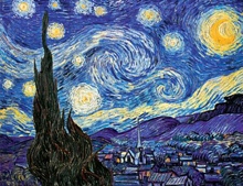
Van Gogh’s Starry Night
Hokusai uses the colors in a slightly more subtle manner, but they are still there. The value of the hue that he uses can be confusing because it it more complex then the bright bold blues we are used to, but they are still opposite each other on the color wheel.
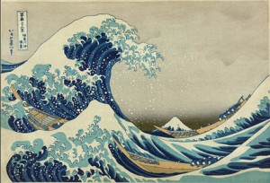
Hokusai’s Great Wave
The 12 steps that we have been using on the color wheel can become more complex by adding white or black to the original hue. That is when you get different shades of the same color, or different tints of the same color. Shade is the term applied when you add black to a color, and tint is the term applied when white is added. When we walk in to the paint aisle, that is where we get very confused. Earlier on in this series I mentioned how helpful it would be to actually have a color wheel in hand to help you sort out what lies opposite each other. I would definitely recommend one to help you narrow these down. Rooms can look very unbalanced if you paint one wall in a very dark shade of a color and the other in a very light tint.
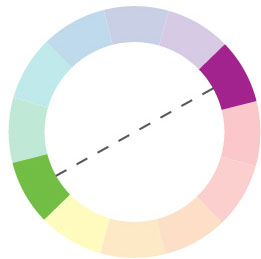
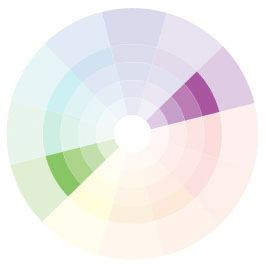
Here is another complimentary color pairing
Here is the same complimentary pairing with different tints
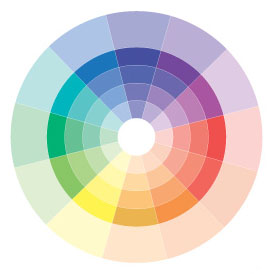
The 12-step color wheel with different tints
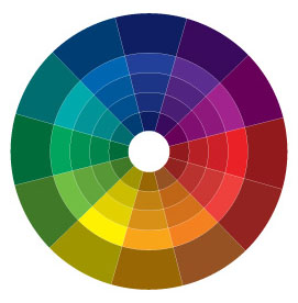
The 12 step color wheel with different shades
Comments are closed here.